Layout & grid
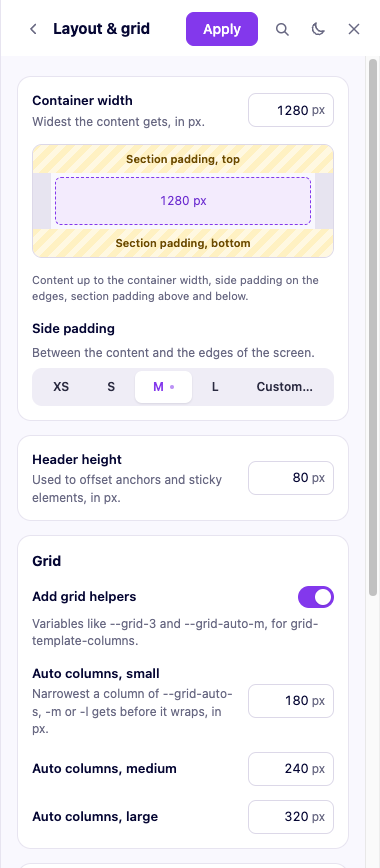
The content container's maximum width, the side gutter it gets on narrower screens (itself a spacing role, so it scales with everything else), your fixed header's height (used to keep an anchor link's target from landing underneath it), and optional intrinsic grids that lay out columns on their own — you set a minimum column width per size (small, medium, large) and the grid fits as many as it can at any screen width.
A live sample elsewhere in the panel (Space) shows your container at several common content widths, each with its pixel value at your current container size — useful for deciding how wide an image, a form, or a block of text should actually sit before you go write the CSS for it.