Site
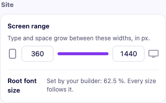
Screen range is the smallest and largest screen width (in px) that type and spacing grow between — the two numbers every fluid scale in Typography and Spacing & layout scales against. Outside that range, a size stays pinned to its smallest or largest value instead of continuing to shrink or grow.
Root font size is read-only here, and what it means depends on your
builder: on Bricks, the plugin measures the root size Bricks itself is
already using and the recipe follows it — changing it would rescale every
rem on the site, not just the framework's own, so the plugin never
overwrites it. On Etch, which has no such setting of its own, the
framework sets and owns the root.