Shape
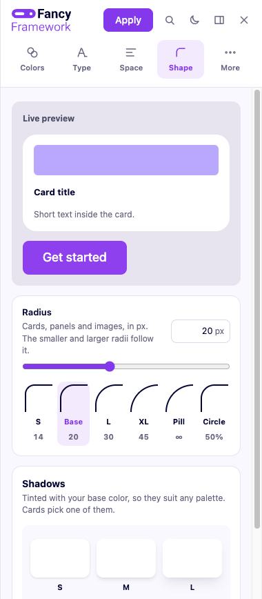
Radius
One base radius (0 to 48 px, with a live preview) drives a small scale of related radii — smaller, larger, extra large, a pill shape for fully rounded buttons, and a perfect circle — so a single slider reshapes buttons, cards, inputs and badges together, consistently.
Shadows
A small scale of shadow strengths, from a subtle lift to a clear one, for whatever in your design needs to sit visibly above the page.
Buttons and cards
Both pick up their radius and shadow from this scale by default — a pill radius for buttons, a base radius and no shadow for cards — and can be set independently from there. Their own screens, with padding and live previews, are in More settings: Buttons and Cards.